

Last time we talked about our decision to go it alone as Ghyston. It was one of those fraught, long-time-coming decisions that took a lot of ultimately justified consultation. But once that’s done, the fun begins!
New Brand
We consulted with Bristol-based Branding agency Proctor and Stevenson for advice on beginning the journey. They listened to our history and our visions for the future, and our decision process on going it alone. From here they set about creating branding options for us, the first being deciding on the ‘logo type’.
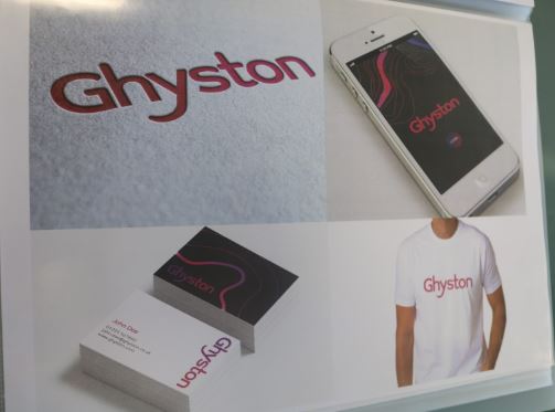
Yes - the left-field option of a neon purple was nearly in our candidate choices, but luckily we saw sense and went with the ‘Ghyston Green’:
![]()
But a brand is not all about a logo - we drew up a tabiya of principles, articulating within them our purpose, our mission and our values. Remember that whilst your logo is the most repeated representation of all of that, but it is still just a logo.
Design Principles
Design is never in a vacuum, and should therefore never be without direction and purpose. Using clear and concise brand guidelines can be the measure, the purpose - boiled down to handy phrases you can plaster over a wall.
As we saw, naming can be a chaotic process - and that’s just for one single word. Design - on the surface - is the sum of all a brand’s outputs. Imagine having multiple people work on multiple outputs with no shared purpose or vision. This is why you articulate these things at a company level and make sure everyone understands what they should be working towards.
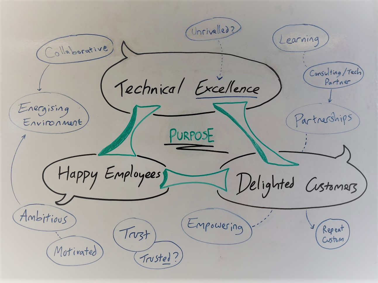
How you design things should come straight out of the company’s purpose - or as was the case for us, reworded to be as usable as possible.
Brand guidelines are simply an expression and an application of that core purpose - the sum of a company’s philosophy.
Once they are written, they should stay visible so that all design decisions can be checked against them. You can more easily see when ideas and features are straying off the track, or when content is off-target.
1.Transparency
One of the key tenets of how the company is run is a commitment to transparency. And we apply the same in our engagements with customers - if there is a problem we raise it straight away. One of the parts of a sprint process for example is a 'Retrospective' - where everyone feeds back how the last sprint went and what was good and bad.
2.Cross-channel
To expand this one a little further, it is a recognition that digital really is everywhere. At least for our key audiences - it pervades pretty much all aspects of their lives. We build software that underpins entire businesses and we know that the messages that filter through up to the surface must be entirely consistent. So we make the message of our website consistent with messages in our print material, social media channels, and all our conversations.
You must have this approach if you want to build cross-channel journeys. For example, an applicant approached us at a careers fair, intrigued by a coding puzzle printed on a giant banner. They have a conversation with us. They take a card or a flyer, they use this to go to our website where they find the same puzzle and a discussion about it. Any of those channels then lead to a second conversation and the journey continues.
A website is just one channel, it doesn’t have to do everything for you, but it does need to convey the brand visually and be consistent in its messaging.
3.Clear and Simple
This applies to layout and design as much as language and messaging. Our QA manager has also written posts on clarity and simplicity.
4.Demystify Tech
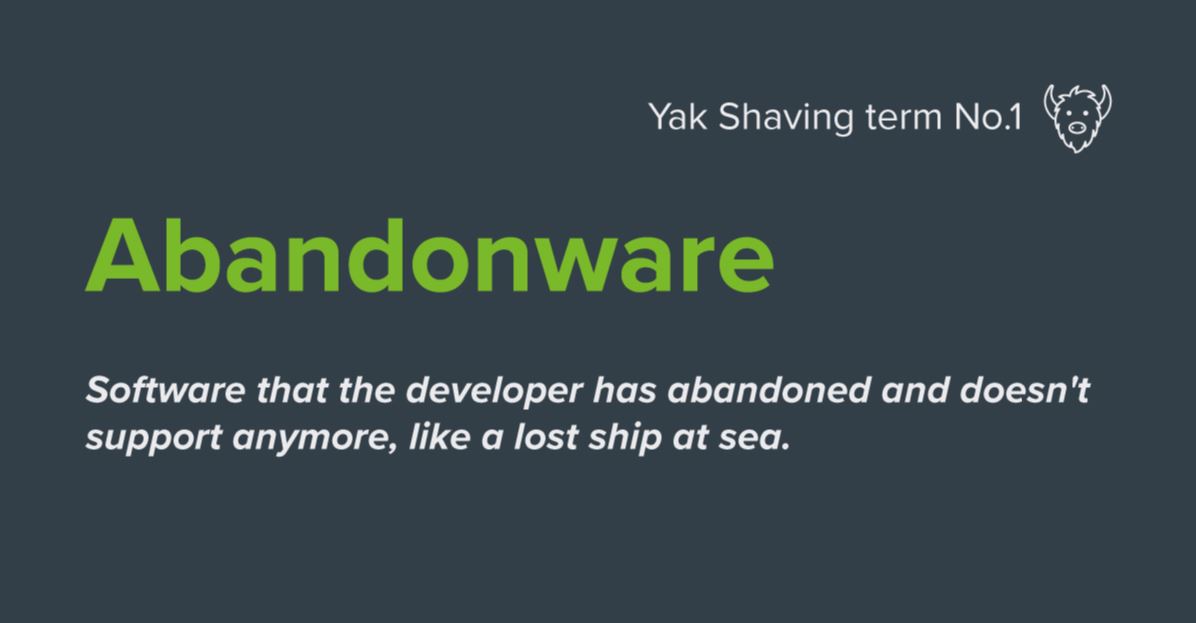
Part of our culture is that we do not refrain from asking questions - or answering them. We recognise that we think and talk about tech a lot. And if we step back for a second, we’re talking complete and utter… jargon. Nevertheless we want to talk to customers, we want to get things right, we want to design with them. The only answer is to demystify terms and concepts wherever possible, and to be as honest and clear as we can without boring everyone with the details. Our digital assets and outputs are no different. We aim to communicate with all readers clearly. We take care in writing all our copy and call ourselves out for jargon and buzzwords. As the website started to fill out, doing a great job of hitting keywords and showcasing the latest tech, the need for a jargon buster of some kind became clear.
So once again we set about our careful naming process to turn ‘jargon-buster’ into something a bit less 1978. Yak Shaving was born.
5.A bit of fun
You may think there’s no place for humour or light-heartedness in an interface. You may even think there’s a time and a place, but not for ‘MVP’, for the first pass, for the top priority.
But you’d be wrong. I’ve heard it said that if aliens landed, the most sophisticated and most human thing they could display is a sense of humour. It articulates so much about how you think. An interface is simply conveying how you think to the people on the other side, in a way they can understand. What your service provides and what kind of service experience you offer - that is what the user will walk away with a sense of - and that will determine whether they return. Humour can be found anywhere - in imagery, interaction design and even in messaging. For example in a sign-up form the copy “We hate spam as much as you do” conveys everything you need to know about their approach to spam email - they don’t need an entire legal statement to either be ignored or slow you down.
Even the most serious companies - whose services are a matter of life and death - use at least some humour in their copy, often reserved for emails, 404 pages, forgotten passwords, and those offbeat journeys where humour adds to the reassurance that they’ve got it all covered. So if they can use it, then we certainly can.
A particularly good example of using humour as a primary principle in message is the marketing agency Noisy Little Monkey.
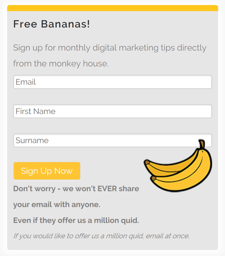
We were never going to go that far, but we certainly enjoyed reading through their site!
6.Prove it
We looked at a lot of other websites and promotional materials from in and outside our industry and we saw a lot of grandiosity, loftiness and empty claims which would surely get David Mitchell back on his soapbox if he saw them.
We decided that part of being a mature and confident company was not doing that. We knew that behind all that was our audience skipping through and scrolling to the facts or rolling their eyes. We knew it ultimately led to disappointment somewhere down the line. So we challenged ourselves; if we’re such a great place, and offer such good service, let’s just prove it.
In the same light, I hope this article proves our approach to transparency!
Until next time - Ghyston.

