

Background blur was first introduced in Windows Vista and then later in iOS7, we’re talking 2006, that’s some well-matured vintage UI. Building on this foundation its new refreshed form seems to be here to stay. Apple’s new OS Big Sur sees the return of transparent background blurs to the Mac; Microsoft show it in their Fluent Design System, where it goes by the name ‘Acrylic’; and it’s popping up in website and app designs.
What is Glassmorphism?
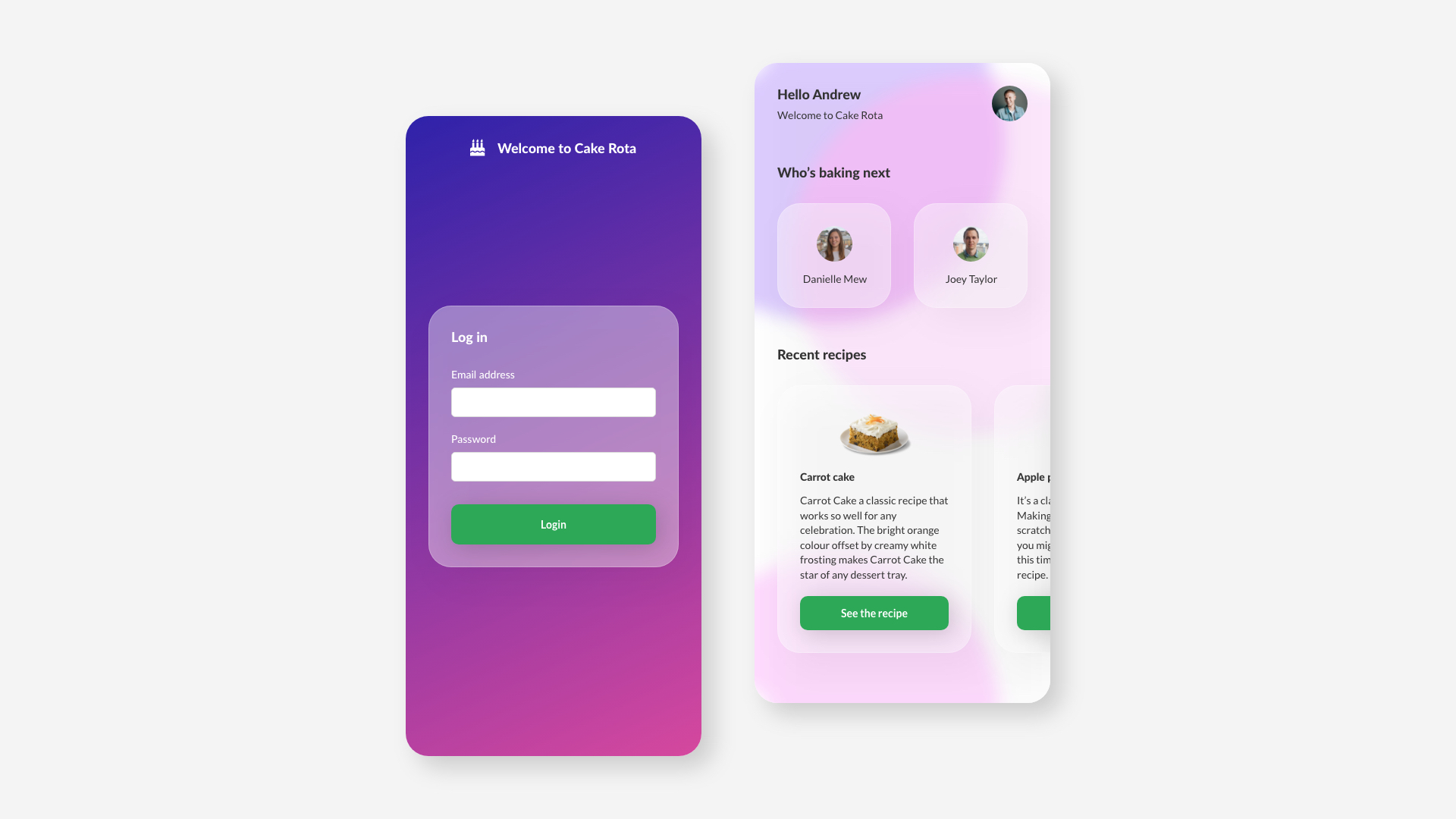
The defining characteristics of Glassmorphism are objects with a semi-transparent background, background blur and a subtle light border. Blend all that together in the right way and you have yourself some premium looking glass. Take that to the next level and start stacking those objects vertically and you're not only giving your interface some depth but helping the user to establish a visual hierarchy on the objects. Put all this on top of a vibrant gradient or jazzy background and you’ve officially graduated in Glassmorphism.
Graduation done, time for mastery.
Here are a few things to consider when you’re incorporating Glassmorphism into your UI.
Fine tune your transparency
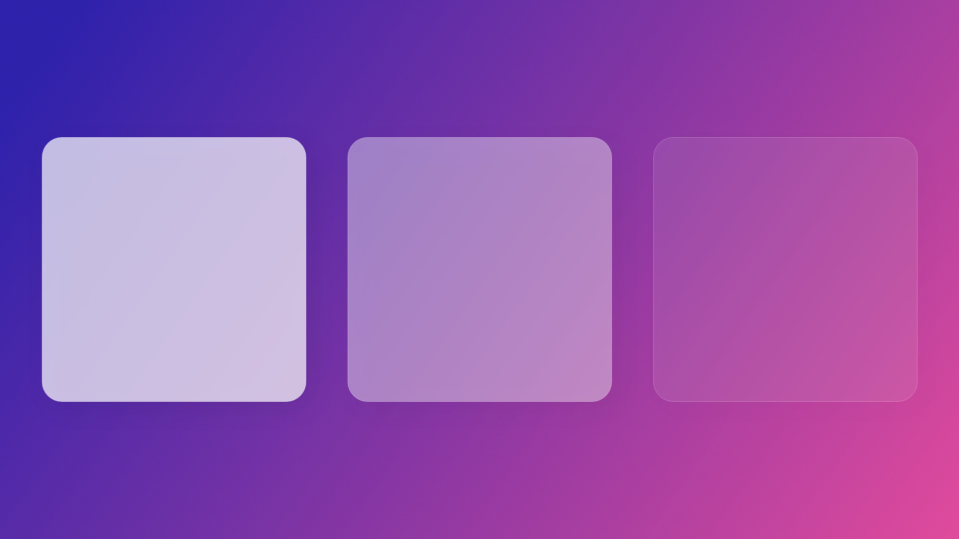
The transparency and background blur are key elements to nailing Glassmorphism – small adjustments here are going to have a big impact on the overall look. We’re aiming for the right mix of transparency and background blur to create the glass effect, but we have to go easy – getting this right doesn’t come without its trip hazards. Dial the transparency up too high and you’ll let too much of the background through, losing clarity on your content and giving you an accessibility nightmare. Don’t dial it up enough and you lose the glass effect and just have what looks like a grey box with drop shadow. If you’re looking for extra credit, then you can start to experiment with a very subtle gradient from a top to bottom corner.
Give the interface some depth

Glassmorphism is essentially a card-based layout with some special sauce. Using the transparency of the objects we can start to layer them on top of each other to give the interface depth. The user can see a glimpse of the content through the glass which means we can create a strong visual hierarchy for the content. Using shadows with the transparency on our objects can enhance this sense of depth even further. If we consider the user to be our shiny light source, then the objects closer to them see more of the light. If we give these a slightly higher transparency and a subtle shadow then we’re using those fine details to make some magic.
Get the right background
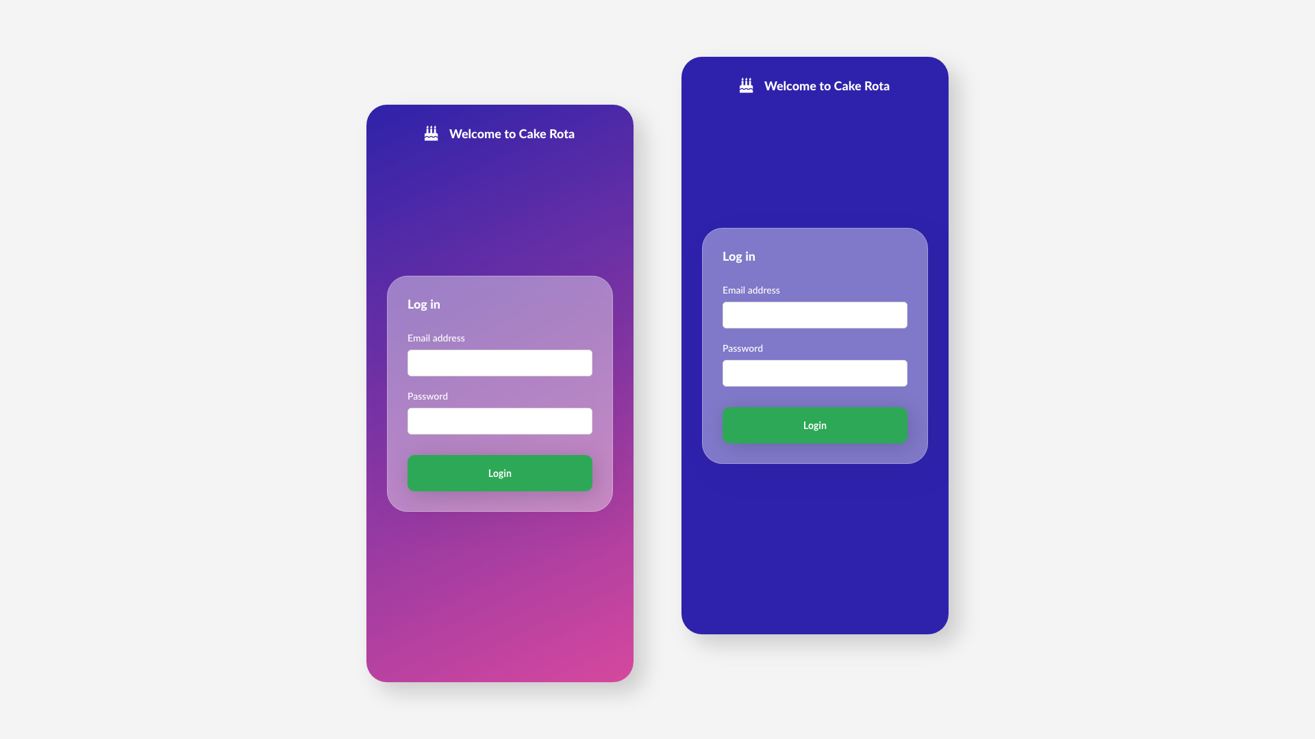
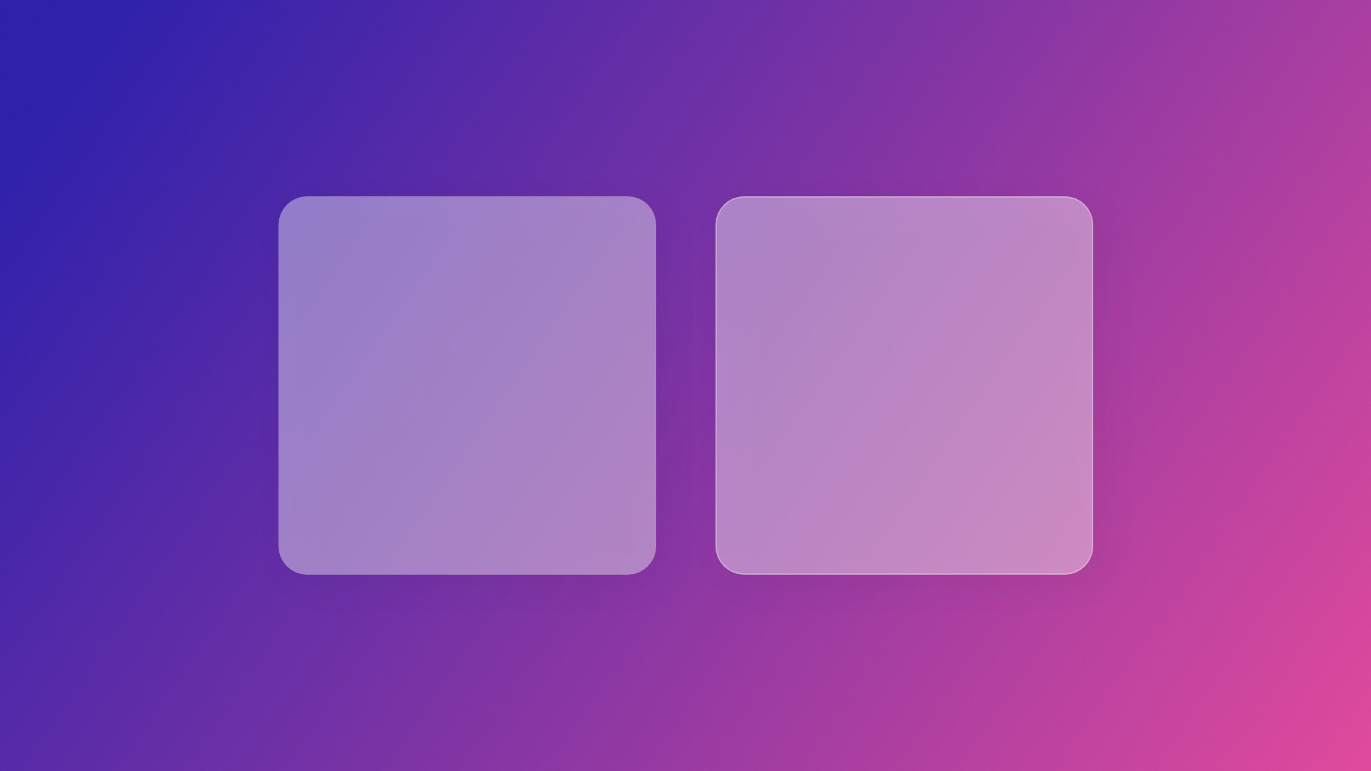
We’ve put a lot of time into our transparency and blurs, but truth is our glass is going to smash if it’s not supported by a good background. A vibrant, colourful background is the Ron Weasley to our Harry Potter, it’s not the main character but we’re not going to get very far without it. Take the examples below: the one colour blue background isn’t dull by any means, but by using one colour it’s not making our glass effect sing. When the background has colour differences like the gradient example it’s easy to see the glass effect that we’re sitting on top of it. I encourage you to experiment with different background options – it could be an image that you’ve blurred, it could be a simple pattern, there are options and it’s definitely worth exploring. Again, there’s something to watch out for when we’re choosing our background, we need interest, but we don’t want it to overpower the content, it is a background after all. Accessibility also needs to be thought about at this point, even though our content will be sitting on a glass card, this card is letting a blurry version of the background through so consider this when picking background and type colours.
Slim borders
Another small but key feature of Glassmorphism that we haven’t touched on yet is the border. It may seem like a small detail, but giving the glass object a thin light border really helps to pick it out from the background and adds to the glass effect by giving it the feeling of an edge. You will be glad to hear that there isn't any danger of adversely affecting accessibility with the border. When we're experimenting with our border, we’re firmly in decoration-only territory.
Content clarity and accessibility
When we’re talking about accessibility using Glassmorphism, content hierarchy, contrast and clarity are important. We’re playing with transparent objects on a vibrant background so the waters can be hard to navigate but maintain good design patterns and best practises and we should sail through. As lovely as it does look at this point it’s good to consider the glass as decoration, will our content make sense without it? The answer should be yes. If we group our content in the right way and have good functional hierarchy you could take away the glass and everything would still work and make sense. The glass effect should be thought of in this way and used on card backgrounds or similar objects and avoided on buttons and other content, that way we can make sure the content is accessible to all.
Farewell master
I think it’s clear that Glassmorphism is going to continue growing in popularity and we’re going to see much more of it over the coming months. One of the exciting things as a designer is to watch how the trend evolves, as more people work with it more possibilities and styles start to present themselves and it gets taken to the next level. I’m a long-time lover of flat interfaces but the new sense of depth and injection of colour that Glassmorphism brings is refreshing, long may it continue!

