

More and more people are coming to realise how providing their users with great Design and UX is essential to a successful product, rather than an optional choice, and I’m welcoming those people with open arms! Designers are now happily taking a seat at the strategy table, bringing their skills into products early, and crafting something special. With this happening across almost all sectors products that haven’t invested in their design will struggle. So, let’s dive deeper into some examples of great user experience design to see how that design time pays you back later down the line.
Duolingo
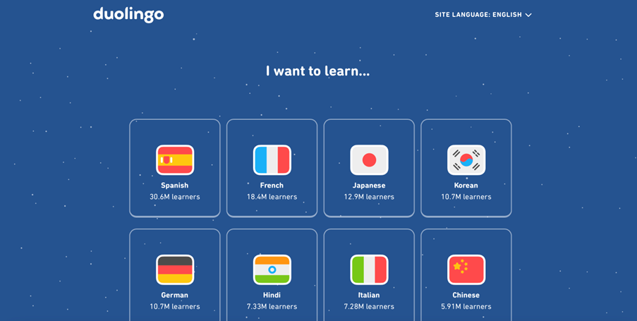
I love Duolingo, I’ve been using it to learn Spanish for about 6 months and having recently had the pleasure of visiting Spain I can vouch for it working out in the wild. They’ve built an easy-to-use product which looks beautiful, the character animation mixed with gamification and rewards along the way keeps you engaged and wanting to progress. One piece of their flow I want to highlight is getting started with learning a new language, it takes one question, “I want to learn…” then you’re in. everything after that is optional and you can start learning straight away, no signing up, it's elegant and leads you right where you want to be.
Airbnb
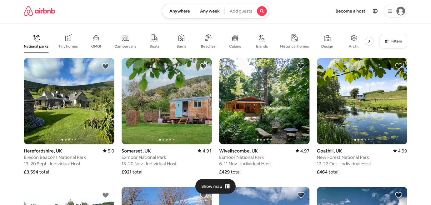
Airbnb has recently had a re-design centred around changing how its users discover properties and experiences. They’ve now organised properties into categories and put this at the front of the experience, flipping the standard model on its head and helping users find amazing properties in places they may never have known existed.
Honestly, I think it’s incredible and I love not only how it makes the home page so much more appealing by showing users the fantastic properties on offer instead of a blank search box but it also makes looking for a property feel freer, you find the best place for you and worry about travel arrangements second.
MailChimp
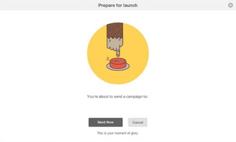
Putting a furry face to what could be an otherwise boring task. Adding delight to a user’s journey through a product is a big part of a designer's job, aiming to add some excitement or personality to the mundane. This is something MailChimp knocks out of the park with Freddie the friendly monkey mascot who pops up at various points to give you high fives and generally lovely encouragement. Freddie is there with you along for the ride and even understands how nerve-racking it is to hit the button on a big email campaign! Adding this personality to the user experience helps to make what could be a bit of a tedious or scary process of arranging email marketing quite a hefty chunk more fun.
Headspace
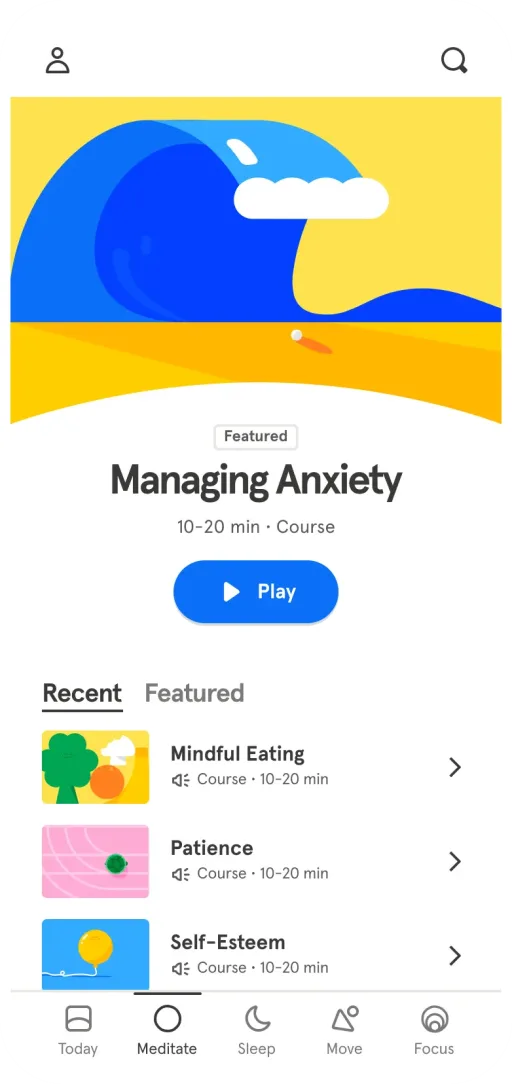
Headspace has had to navigate the tricky waters of helping its users to relax using technology, something that isn’t inherently calming. The soft rounded design that they’ve become known for is made all the more beautiful when it’s coupled with their simple navigation, driven by how you’re feeling, what you’re looking to do like sleep or even what you’re struggling with like money worries you are feeling zen in no time. The on-screen animations, while you’re in a session, are just the right amount you need but without being intrusive.
Sometimes you can’t beat the classics and the Google home page is certainly a classic. Holding the wealth of knowledge the internet holds behind a simple white page with a search box seems like such an obvious idea now we have seen it so many times but getting to that has taken some time and the bravery to take elements away, keep it simple and just show the user what they need.

